Fluid Typography: Responsive Type Without Media Queries
For a long time, responsive typography felt like a constant battle with the window resizer. We’d set a font size for mobile, then write a media query for tablet, another for desktop, and maybe one more for ultra-wide screens.
The problem? Text “snaps” awkwardly between sizes. In 2026, we’ve moved past this “staircase” approach. Instead of hard-coding jumps, we’re using mathematical slopes to make type feel natural on any device.
Layout vs. Typography
Let’s be clear: Media queries aren’t going anywhere. You still need them to flip a sidebar to the bottom of the screen or change a 4-column grid into a list. But using them to manage font size is a waste of time.
Typography should be a fluid constant. It should breathe with the container, not wait for a specific pixel trigger to suddenly get bigger.
How clamp() Actually Works
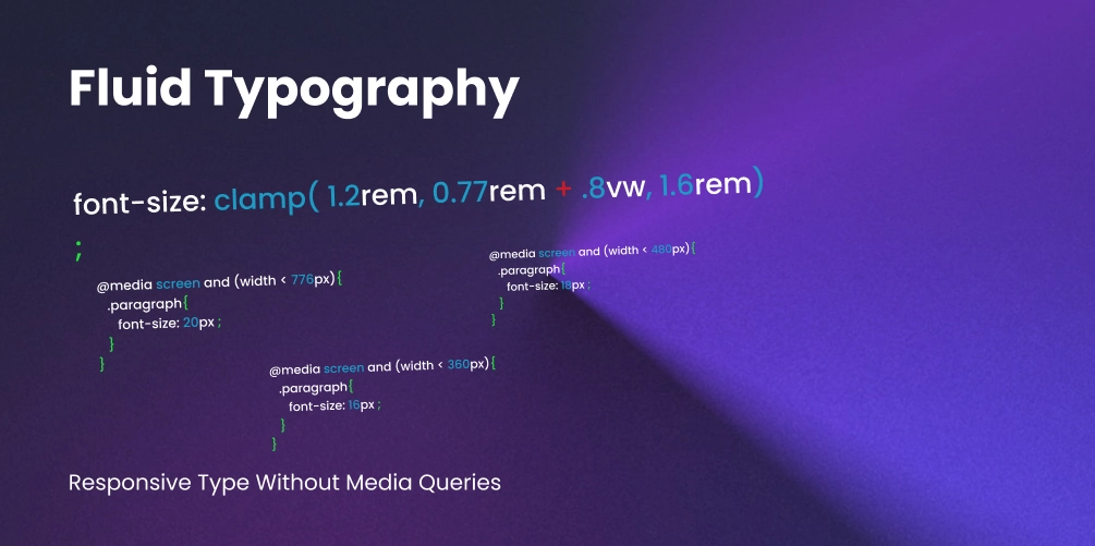
The clamp() function is the “Swiss Army Knife” of modern CSS. It allows you to define a font size that grows and shrinks with the viewport, but stays within a strictly defined minimum and maximum range.
The Anatomy of a Clamp
h1 {
  /* clamp(MIN, VAL, MAX) */
  font-size: clamp(2rem, 5vw, 4rem);
}- The Floor (2rem): The smallest the font will ever get, regardless of how tiny the screen is.
- The Slope (5vw): The “ideal” value. It uses viewport units to scale dynamically.
- The Ceiling (4rem): The largest the font will ever get, preventing it from becoming comically huge on 4k monitors.
Why This Beats Media Queries
Traditional media queries create silos of design. If a user has a browser window at 767px, they get the mobile experience. At 769px, everything suddenly jumps.
With clamp(), the typography is context-aware. It calculates the “in-between” states perfectly. This means your design looks intentional at 432px, 921px, and 1440px without you ever writing a single extra line of CSS.
The Math Problem (and the Solution)
Here is the cold truth: Humans are not meant to calculate fluid slopes in their heads. To make a font scale perfectly from 20px at a 320px viewport to 480px at a 1240px viewport, you need a complex linear interpolation formula involving pixels and viewport units. Writing this manually is a recipe for bugs.
Enter Utopia.fyi
The secret weapon of every expert creative developer is Utopia.fyi.
Utopia treats typography as a system rather than a set of isolated values. You provide your minimum and maximum viewport widths and your desired type scale (like a Major Third or Golden Ratio), and it generates the CSS variables for you.
:root {
  /* Generated by Utopia.fyi */
  --step-0: clamp(1rem, 0.92rem + 0.39vw, 1.25rem);
  --step-1: clamp(1.2rem, 1.05rem + 0.73vw, 1.67rem);
  --step-5: clamp(2.49rem, 1.76rem + 3.63vw, 4.77rem);
}

h1 { font-size: var(--step-5); }
p  { font-size: var(--step-0); }
Pro-Tip: Accessibility and Zoom
One common mistake is using only vw units inside clamp. If a user zooms in on their browser, vw units don’t always scale as expected, which can break WCAG accessibility guidelines.
Always use a relative unit (rem) as part of your “slope” calculation. Note: Utopia does this automatically by combining rems and vws in a calc() inside the clamp, ensuring your text remains zoom-friendly.
Summary: A Cleaner Stylesheet
By switching to a fluid system:
- You delete hundreds of lines of
@mediaboilerplate. - You ensure visual harmony across every device.
- You bridge the gap between design and code by using a mathematical scale.