Reusable CSS Layout Systems: Primitives Over Patterns
There is a point where “being organized” quietly turns into “building a framework by accident.”
It usually starts with good intentions. You want consistency. You want reusable layouts. You do not want to rewrite the same display: grid rules twenty times. So you create a few utilities, abstract a few patterns, add a wrapper, then a stack helper, then a cluster helper, then a grid helper, then ten modifiers, then responsive variants, then exceptions for those variants.
A few months later, your CSS has its own philosophy, its own internal language, and a learning curve that is somehow worse than just writing layout styles where you need them.
The problem is not reuse. Reuse is good. The problem is turning layout into a system so abstract that it stops feeling like CSS and starts feeling like a product you have to maintain.
The Real Goal of a Layout System
A good reusable layout system should do three things well:
That last one matters most. Layout is one of the most contextual parts of UI. A card list, a hero, a pricing table, and a blog post body may all use grid or flex, but they should not be forced through the same over-engineered abstraction.
A layout system is not a huge class library. It is a small set of reliable patterns for recurring structure, page width, vertical rhythm, grouping and spacing, horizontal alignment, repeatable grids, and edge-to-edge sections. If your system is trying to define every possible layout permutation in advance, it is probably becoming too framework-like.
Start with Layout Primitives, Not Page Templates
One of the easiest mistakes is jumping straight into highly specific helpers like .layout-hero-with-image-left or .layout-three-col-feature-grid. These feel productive at first, but they hard-code intent too early. They solve one screen, one page, one component structure.
Instead, start with primitives that describe spatial behavior and a handful of shared tokens:
:root {
  --content-max: 72rem;
  --content-narrow: 42rem;
  --gutter: 1rem;
  --section-space: clamp(3rem, 6vw, 6rem);
  --stack-space: 1rem;
  --grid-gap: 1.25rem;
}
Then build your primitives on top of those:
Container
Centers content and constrains max width. The most-used primitive in any layout system.
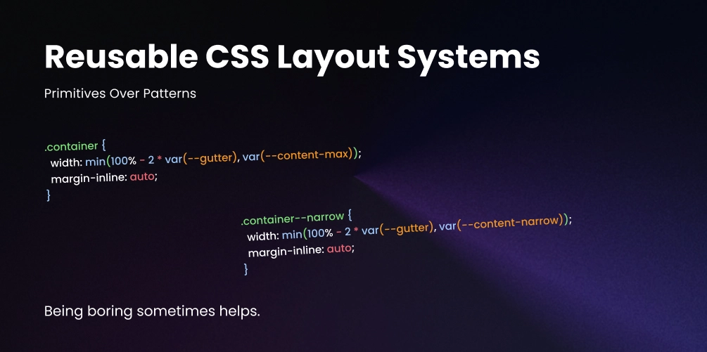
.container {
  width: min(100% - 2 * var(--gutter), var(--content-max));
  margin-inline: auto;
}

.container--narrow {
  width: min(100% - 2 * var(--gutter), var(--content-narrow));
  margin-inline: auto;
}
Section
Adds consistent block-level breathing room between page sections. Keep it boring.
.section {
  padding-block: var(--section-space);
}
Stack
Creates vertical gaps between sibling elements using grid. Configurable via data attributes.
.stack {
  display: grid;
  gap: var(--stack-space);
}

.stack[data-space="sm"] {
  --stack-space: 0.5rem;
}

.stack[data-space="lg"] {
  --stack-space: 2rem;
}
Cluster
Groups inline items like tags, buttons, or meta info. Wraps naturally at any width.
.cluster {
  display: flex;
  flex-wrap: wrap;
  gap: 0.75rem;
  align-items: center;
}
Auto grid
Repeats items into a responsive grid without any media queries. The column width is configurable.
.auto-grid {
  display: grid;
  grid-template-columns: repeat(auto-fit, minmax(min(16rem, 100%), 1fr));
  gap: var(--grid-gap);
}
Split layout
Stacks on small screens, splits into two columns on wider ones. Proportions are configurable.
.split {
  display: grid;
  gap: 2rem;
}

@media (min-width: 48rem) {
  .split {
    grid-template-columns: 1.2fr 0.8fr;
    align-items: start;
  }
}
That is already enough to build a surprising number of pages.
Reusable Does Not Mean Generic-Looking
A lot of developers avoid reusable layout systems because they think reuse leads to sameness. That only happens when you reuse too much at the wrong level.
You do not want every section to look identical. You want every section to obey a few consistent spatial rules. There is a difference.
The layout primitives handle spacing, width, and structure. The component classes handle personality, visuals, and content styling. That separation is what keeps the system from turning into a framework.
<section class="section">
  <div class="container">
    <div class="stack" data-space="lg">
      <h2>Selected Work</h2>
      <div class="auto-grid">
        <article class="project-card">...</article>
        <article class="project-card">...</article>
        <article class="project-card">...</article>
      </div>
    </div>
  </div>
</section>
Keep Primitives Low-Specificity and Boring
Your layout primitives should be some of the most boring CSS in your codebase. That is a compliment.
They should not set colors, shadows, borders, typography, or component aesthetics. They should mostly manage space and structure.
/* ✅ Good — a layout primitive */
.stack {
  display: grid;
  gap: var(--stack-space, 1rem);
}

/* ✕ Bad — a component pretending to be a primitive */
.stack {
  display: grid;
  gap: 1rem;
  background: white;
  border-radius: 1rem;
  box-shadow: 0 1rem 2rem rgb(0 0 0 / 0.08);
  padding: 1.5rem;
}
The second version is no longer a layout primitive. That mixing of responsibilities is where systems get messy.
Avoid Class Explosions with Custom Properties
One reason layout systems become framework-like is that every variation gets a new class. You start with .grid-2, .grid-3, .gap-sm, .gap-md, .align-center, and before long you have utility soup.
A cleaner approach is to make a primitive configurable with custom properties:
.grid {
  display: grid;
  gap: var(--gap, 1rem);
  grid-template-columns: var(--columns, 1fr);
  align-items: var(--align, stretch);
}
Now you can adapt it inline without inventing a class for every combination:
<div class="grid" style="--columns: repeat(3, 1fr); --gap: 2rem;">
  ...
</div>
Or scope the override inside a component’s own CSS:
.feature-list {
  --columns: repeat(auto-fit, minmax(18rem, 1fr));
  --gap: 1.5rem;
}Build Around Patterns You Actually Repeat
A common mistake is designing a layout system from imagination instead of from real projects. Do not ask “What layout helpers might I need someday?” Ask “What layout decisions have I repeated at least three times already?”
That is your system. A layout system should emerge from repetition, not ambition.
Use Composition, Not Configuration Overload
When systems become framework-like, they often try to solve every problem through one mega-class. A single .layout object with a dozen custom property knobs. Technically flexible. Practically exhausting. When a class can do everything, it usually communicates nothing.
In real interfaces, composition of focused primitives is almost always clearer:
<section class="section">
  <div class="container">
    <div class="split">
      <div class="stack" data-space="lg">
        <h2>Designing with motion</h2>
        <p>Animation works best when it reinforces structure.</p>
        <div class="cluster">
          <a href="#">Read more</a>
          <a href="#">See examples</a>
        </div>
      </div>
      <figure class="media-frame">
        <img src="poster.jpg" alt="">
      </figure>
    </div>
  </div>
</section>
This is readable because each class has a narrow job. That matters more than theoretical flexibility.
From Messy Page-Specific CSS to Reusable Structure
Here is what the refactor looks like in practice. The goal is not to remove all specificity. It is to move the recurring structure into shared primitives and keep local decisions local.
<section class="homepage-featured-posts">
<div class="homepage-featured-posts-header">
  <h2>Featured Posts</h2>
</div>
<div class="homepage-featured-posts-list">
  <article class="post-card">...</article>
  <article class="post-card">...</article>
  <article class="post-card">...</article>
</div>
</section>

/* CSS */
.homepage-featured-posts {
max-width: 72rem;
margin-inline: auto;
padding-inline: 1rem;
padding-block: 4rem;
}
.homepage-featured-posts-header {
margin-bottom: 2rem;
}
.homepage-featured-posts-list {
display: grid;
grid-template-columns:
  repeat(auto-fit, minmax(18rem, 1fr));
gap: 1.5rem;
}
<section class="section">
<div class="container">
  <div class="stack" data-space="lg">
    <header>
      <h2>Featured Posts</h2>
    </header>
    <div class="auto-grid featured-posts-grid">
      <article class="post-card">...</article>
      <article class="post-card">...</article>
      <article class="post-card">...</article>
    </div>
  </div>
</div>
</section>

/* CSS — only the local override stays */
.featured-posts-grid {
--grid-gap: 1.5rem;
grid-template-columns:
  repeat(auto-fit, minmax(min(18rem, 100%), 1fr));
}
The shared layout rules moved into primitives. The component keeps the one local adjustment it actually needs. That balance is the whole point.
Let Components Own Their Final Layout When Needed
Not every layout decision should be abstracted. This is where many systems go wrong: they assume every layout pattern belongs in the shared layer.
Sometimes a layout only matters inside one component and that is perfectly fine:
.pricing-card {
  display: grid;
  gap: 1rem;
  padding: 1.5rem;
}

.pricing-card__features {
  display: grid;
  gap: 0.75rem;
}How This Works in React and Astro
The same principle applies in component-based workflows. Do not rebuild your layout system as a giant prop-driven abstraction layer unless you truly need it.
export function Section({ children, narrow = false }) {
  return (
    <section className="section">
      <div className={narrow ? "container container--narrow" : "container"}>
        {children}
      </div>
    </section>
  );
}
Usage stays clean and readable:
<Section>
  <div className="stack" data-space="lg">
    <h2>Latest Experiments</h2>
    <div className="auto-grid">
      <article className="card">...</article>
      <article className="card">...</article>
    </div>
  </div>
</Section>
You do not need <Layout type="grid" columns="3" gap="lg" align="start" maxWidth="wide" section stack="lg">. That is just CSS classes disguised as component props. Astro works especially well with this CSS-first approach for exactly that reason.
Warning Signs Your Layout System Is Becoming a Framework
If you notice any of these, it is time to simplify.
You need documentation just to place two blocks side by side
That means the abstraction is too clever. A layout primitive should be self-explanatory.
Every new layout requires adding more variants
That means the primitives are too rigid or too ambitious. Custom properties solve most variant needs.
Markup is full of classes that describe implementation, not structure
The HTML becomes noisy and hard to scan. Primitives should make markup easier to read, not harder.
Your shared layout classes are styling components by accident
Spacing helpers start setting visual design. Once a primitive touches color or shadow, it has stopped being a primitive.
You feel pressure to use the system even when local CSS would be simpler
A system should reduce friction, not create guilt. If local CSS is cleaner, write local CSS.
A Small But Durable Starter System
This is enough to support a lot of real design work. It is not flashy and it is not trying to be a framework. It is just a stable spatial language.
:root {
  --gutter: 1rem;
  --content-max: 72rem;
  --content-narrow: 42rem;
  --section-space: clamp(3rem, 8vw, 7rem);
}

.container {
  width: min(100% - 2 * var(--gutter), var(--content-max));
  margin-inline: auto;
}

.container--narrow {
  width: min(100% - 2 * var(--gutter), var(--content-narrow));
  margin-inline: auto;
}

.section {
  padding-block: var(--section-space);
}

.stack {
  display: grid;
  gap: var(--stack-space, 1rem);
}

.cluster {
  display: flex;
  flex-wrap: wrap;
  gap: var(--cluster-gap, 0.75rem);
  align-items: center;
}

.auto-grid {
  display: grid;
  grid-template-columns: repeat(
    auto-fit,
    minmax(min(var(--grid-min, 16rem), 100%), 1fr)
  );
  gap: var(--grid-gap, 1rem);
}

.split {
  display: grid;
  gap: var(--split-gap, 2rem);
}

.bleed {
  width: 100vw;
  margin-inline: calc(50% - 50vw);
}

@media (min-width: 48rem) {
  .split {
    grid-template-columns: var(--split-columns, 1fr 1fr);
    align-items: var(--split-align, start);
  }
}
The Rule of Thumb
When deciding whether something belongs in the layout system, use a simple test:
Will I reuse this pattern across multiple parts of the site without needing to explain it every time?
If yes, it is probably a good candidate for a shared primitive. If not, keep it local. That one decision filters out a lot of unnecessary abstraction.
The best CSS layout systems are not the most complete. They are the ones that quietly remove repetitive work without stealing clarity from your markup or flexibility from your design process. They give you rhythm, constraint, and consistency without asking you to memorize an internal framework just to build a page.
If your layout system still feels like CSS, still reads like HTML, and still leaves room for component-level judgment, you are probably getting it right.