Implementing 3D Object Motion with CSS preserve-3d
For a long time, the web was flat. When we wanted depth, we reached for heavy 3D engines like Three.js. But as browser hardware acceleration has matured, we’ve gained the ability to build sophisticated, spatial interfaces using nothing but native CSS.
By mastering preserve-3d, you can transform a standard 2D layout into a layered, immersive experience without the performance overhead of a canvas-based renderer.
The Concept of Z-Space
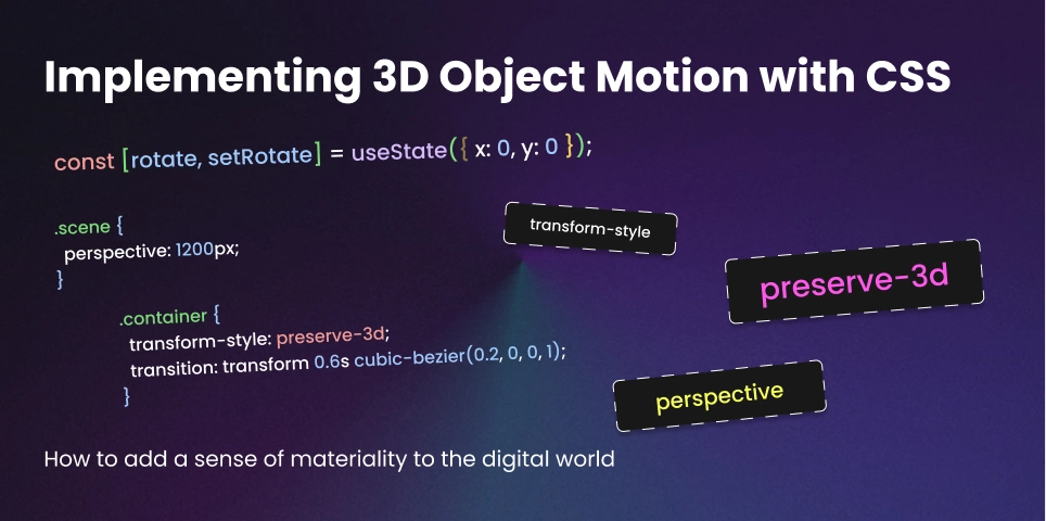
In a standard web layout, elements live on the X and Y axes. To enter the world of Spatial UI, we must unlock the Z-axis. The secret lies in two specific properties: perspective (applied to the parent) and transform-style: preserve-3d (applied to the container).
Without preserve-3d, any child elements of a transformed parent are flattened into the same 2D plane. With it, children can live independently in 3D space, passing through each other and casting real-time visual depth.
1. Setting the Stage: The Perspective Wrap
Before you can move objects in 3D, you have to define where the user’s “eye” is. This is done via the perspective property. A lower value (like 500px) creates intense, dramatic distortion, while a higher value (like 2000px) feels more natural and subtle.
.scene {
  perspective: 1200px;
  width: 100%;
  height: 100vh;
  display: flex;
  align-items: center;
  justify-content: center;
}

.container {
  width: 300px;
  height: 400px;
  transform-style: preserve-3d;
  transition: transform 0.6s cubic-bezier(0.2, 0, 0, 1);
}
2. Building the “Floating” Card
One of the most effective uses of Spatial UI is the depth-layered card. Instead of a flat image, we stack layers at different Z-positions. When the card rotates, the layers move at different speeds, creating a stunning “Parallax” effect that feels physical.
.card-bg {
  transform: translateZ(0px);
}

.card-content {
  /* This layer "pops" out toward the user */
  transform: translateZ(50px);
}

.card-tag {
  /* This layer floats even further out */
  transform: translateZ(100px);
}
3. Interactive Motion with React
Since you are a Creative React Developer, you can hook these 3D transforms into mouse coordinates. By mapping the user’s mouse position to a range of -20deg to 20deg, you create an interface that “looks” at the user.
import { useState } from 'react';

export const SpatialCard = () => {
  const [rotate, setRotate] = useState({ x: 0, y: 0 });

  const handleMouseMove = (e) => {
    const { clientX, clientY, currentTarget } = e;
    const { width, height, left, top } = currentTarget.getBoundingClientRect();

    // Calculate rotation based on center point
    const x = ((clientY - top) / height - 0.5) * 40;
    const y = ((clientX - left) / width - 0.5) * -40;

    setRotate({ x, y });
  };

  return (
    <div
      className="container"
      onMouseMove={handleMouseMove}
      style={{ transform: `rotateX(${rotate.x}deg) rotateY(${rotate.y}deg)` }}
    >
      {/* Layered content here */}
    </div>
  );
};
4. Why CSS 3D Wins Over WebGL (Sometimes)
- Accessibility: Text inside a
preserve-3dcontainer is still selectable, searchable, and readable by screen readers. - SEO: Search engines can crawl your 3D content just like any other HTML.
- Layout: You can use Flexbox and Grid inside your 3D objects.
- Performance: For a few dozen elements, CSS 3D is significantly more battery-efficient than spinning up a WebGL context.
Final Thoughts
Spatial UI isn’t about making things “spin.” It’s about adding a sense of materiality to the digital world. When an interface has depth, it provides better visual hierarchy and makes the user feel like they are interacting with a real, physical object rather than a flat piece of glass.